We make out the dining area correctly!
The traditional design of the kitchen provides for the division into a working and dining area. The working area, as a functional part of the interior, does not favor decoration and creating an atmosphere of comfort. To emphasize the purpose of the space, as well as to make the main decorative accent in the interior, you can use the dining area in the kitchen.
Ergonomics
Ergonomics is the science of numbers, requiring constructive geometric space planning. Thanks to proper planning, it is possible to arrange all zones and furniture objects in them as efficiently and conveniently as possible. To start the calculations, you will need to evaluate the available area and allocate space for the dining area.
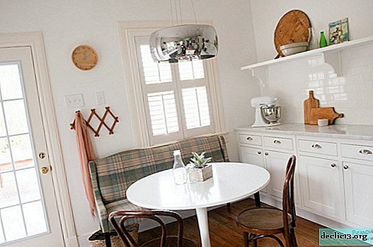
Location of the dining area
There are several options for the location of the dining area in kitchens of various sizes and shapes:
- Single row. Used for rectangular long kitchens. The furniture of the working and dining area is located in one row.
- Double row. The furniture is located at opposite walls (touching or not touching the wall plane) parallel to each other. Convenient for large square kitchens.
- "L "shaped. One of the most common ways of arranging furniture is where a working area is located along a long wall, and after a turn is a dining area.
- "U "shaped. Convenient for rooms where the window is located on the side of the entrance. The dining area can be located both at the edges and in the center of the furniture cascade.
- "G "shaped or peninsular. Suitable for kitchens connected to the living room. The furniture of the working area repeats the "U" shaped way of arrangement, and the "corner" is reserved for the dining area.
- Ostrovnoye. Only suitable for kitchens with a large quadrature. In the case of the island method of arrangement, the dining area should not be in contact with any of the walls or furniture parts of the working area.
- Combined. Modern designers often combine several of the types of layout of the dining area, generating new options. The dining area is connected to the protruding or insular part of the working area. This is a very convenient and practical way for arranging kitchens with a large area, from 8 square meters.


Dining area in a small kitchen
Even a small kitchen needs a dining area, but the scarcity of square meters complicates the zoning process. Not infrequently, due to lack of space, they cover the working area, cleaning up less important parts of furniture and household appliances. This approach can solve the problem, however, it goes against ideas about the aesthetics and design of the room. The technical qualities of space can be used with imagination.
The location of the dining area in the window sill is very convenient, using the window space as a tabletop. To increase seats, the entire dining area is equipped at the window. The table is installed at a distance of 0.5 m or more from the windowsill, and in the interval are chairs or a sofa. This will help increase the free space between the zones.
You can also use the universal folding tabletops or design a plan for furnishing the kitchen in such a way that the dining area acts as a bar counter. It is extremely important to consider that the countertop must have beveled edges in order to increase the usable area.
Design
Thanks to the design, you can give the main aesthetic emphasis, as well as emphasize the selected type of layout, with the help of colors.


The rules that apply to all types of layout of dining ozone, regardless of style and interior qualities are:
- Creating a composition is based on both areas of the interior.
- Highlighting the dining area with light is mandatory.
- The free space between the furniture of the working and dining area should be at least 0.4 m.
Colors and contrasts
Color is the most effective way to highlight a separate part of the interior. Regardless of the basic style of the room, colors should be chosen exclusively in soft tones, to create a psychologically harmonious environment for the place of eating. Warm range of shades of "edible" colors: green, blue, yellow, red will create a competent accent on the main elements of furniture.

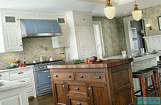
For the arrangement of the dining area located by the island method, it is best to use the game of contrasts between colors and materials. The work area is decorated with inexpressive and non-marking shades of brown, white or gray, in contrast to which a bright table and chairs appear.

The dining area should fulfill the main, main element of the interior of the kitchen, so it is possible to highlight not only color, but also stylistic techniques. The contrast of styles is quite difficult to take shape if the kitchen has an area of up to 8 square meters ... Arrangement of two separate styles requires a complete division of the area into working and dining, each taking up enough space (from 4 square meters).

In the case of island division, this is a feasible and design correct design option. Choosing a style for the design of each of the zones, it is possible not to draw parallels of kinship and compatibility, but primarily, based on the functional and aesthetic requirements of the zone. The more contrast and brighter the combination of styles, the more spectacular the composition of the interior will come out.
Highlighting the dining area
Making the kitchen in a single interior, according to the rules for the formation of an integral composition, the dining area is distinguished by decorative decorations and an emphasis on materials.


There are a number of techniques that can be used to highlight the dining area in the interior of the kitchen:
- Using the floor. The flooring separates the dining area from the work area. This can be one type of coating in different colors or two different types of flooring.
- Using the walls. In the working area, the walls are lined with waterproof and easily washable materials, while in the dining area, more “comfortable” materials are chosen, most often used in the wall cladding of living rooms.
- Using the ceiling. The ceiling is also involved in the design and allocation of zones. It is possible to use suspended multi-level structures, with the help of which not only the zone is distinguished, but also the lighting is supplied favorably.
- With the help of decorative elements. Decor, in any of its manifestations, will do. Textiles: rugs, curtains and panels, as well as tablecloths. Ceramics: vases, dishes. Additional elements: artificial fruits and ikebana, creating a color accent.
- With the help of materials and furniture. The difference in materials for the manufacture of furniture creates an excellent internal contrast.
The best interior styles for the dining area
For the design of the dining area of the kitchen, it is best to use the classic interior styles, which are characterized by the use of natural materials, warm colors, open lighting and moderate decoration. You can combine various features of classic interiors with modern representatives. In a modern, technically equipped interior, the work area looks harmoniously complemented by the soft forms of the classics to design the dining area.


