Hong Kong interior in bright colors
Many homeowners dream of a bright, clean and light image of their home. If, at the same time, it is possible to maintain the minimalist style in the interior, it’s a big luck. Eastern peoples have a lot to learn in the field of home design with an enviable minimalism that does not compromise the comfort and coziness of the home. A light palette in decoration and furnishing is also preferable in this case. It is such a design project for an apartment located in Hong Kong that we would like to demonstrate to you. Spacious and bright rooms, the lightness and cleanliness of the atmosphere which can inspire the repair or reconstruction of their own homes.
We begin our photo tour with the central and most spacious room in the apartment - the living room, which serves as the dining room. Snow-white wall decoration and flooring made of light wood create an incredibly clean, light, almost weightless image of the room. The furniture also does not stand out in contrast; various shades of gray and beige prevail in its performance. Only elements of lighting fixtures and wall decor act as accent spots.
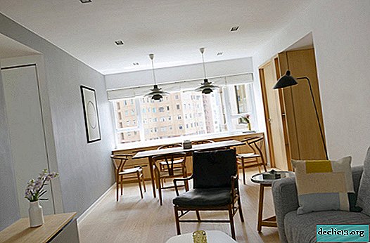
Simple and concise atmosphere, nothing more is the basis of the concept of interior decoration in a Hong Kong apartment. The roomy soft sofa with neutral gray upholstery represents a sitting area. Together with a floor lamp and a small stand, they form a reading area. Opposite the video zone, it is represented by a TV and a small built-in storage system with bright facades. The living room is incredibly simple and even strict, but at the same time it is not devoid of comfort and coziness, its image glows with cleanliness and lightness, airiness.

A low coffee table with a snow-white countertop and wooden legs has become an excellent addition to the lounge area. It is difficult to find massive, heavy furniture throughout the apartment, all pieces of furniture seem light, almost weightless, and as a result, the whole image of the room is combined into one airy image.

One of the few dark spots in the Hong Kong apartment was a chair with a wooden frame and black upholstery on the back and seat. Such dark, contrasting interior items are necessary for our eyesight to focus our attention - it is quite difficult to stay in an absolutely bright room for a long time.

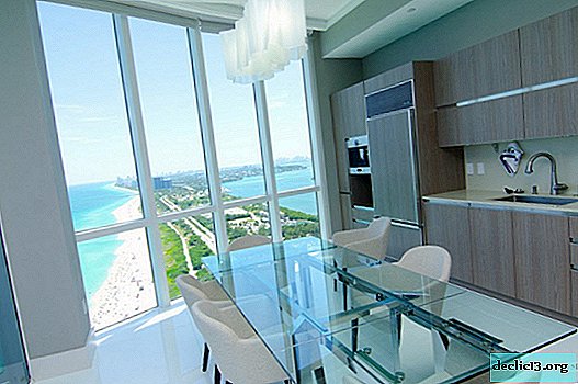
The dining area located at the opposite end of the room is presented in no less laconic version - a spacious dining table and chairs made of wood of various species. A practical design solution was the placement of storage systems in the space under the windowsill, which was extended to the entire width of the room. In sliding and swinging cabinets, you can store dishes, cutlery, tablecloths and napkins - all that can come in handy when serving a table for both daily family dinners and festive receptions.

Completes the image of this functional segment of the home a pair of pendant lights of the original design. But even in the design of lighting fixtures, designers, together with the owners of the apartment, do not allow themselves liberties and choose strict and fairly simple models of chandeliers.

Wall decor in the entire apartment and in the dining room in particular is represented by very modest choice of color palette and paintings, simple in terms of artistic expression. But such works of modern art bring clarity of geometry to the image of the room, create a center of symmetry and can even zonize space, albeit very conditionally.

Within walking distance of the dining room is the kitchen space. The specifics of the cooking room dictate the appropriate layout of the kitchen - in a narrow and long room it was ergonomic to place only a single-row layout of storage systems, household appliances and work surfaces. But with this arrangement of kitchen furniture, it is possible to place a sink near the window, which for many housewives is an unattainable dream.

And again we see a laconic combination of gray, white and light wood in the interior of the room. The steel sheen of the surfaces of household appliances and countertops effectively complements the selected color scheme.

Next, go to the spacious and no less bright room of the bedroom. Of course, in the room for sleeping and relaxing, the central piece of furniture and the all-consuming coordination center is a bed with a soft headboard and an original design of the bedside table, which is part of the bed frame.


Wall panels made of light wood act as an accent to the interior of a light bedroom and effectively mask the door to the bathroom, not to mention the fact that communications systems are hidden behind their surface - wires to wall sconces.

The snow-white finish is ideal for creating a calm, peaceful atmosphere. White color not only calms emotions, sets you up for relaxation and rest, but also allows you to clear your thoughts, prepare for a calm and deep sleep.

Behind the frosted glass sliding doors is a dressing room, which is incredibly convenient in terms of saving time on traffic and collecting in the morning to create an image.

In the dressing room, the snow-white finish already familiar to us is combined with no less familiar furniture made of light wood. Open cabinets with bars are an excellent option for storage systems for various types of clothes, and the wardrobe island is a great opportunity not only to create additional containers for arranging accessories and shoes, but also a roomy stand for bags, jewelry and other small things.

In the design of the bathroom, the designers did not deviate from the basic colors that were shown throughout the apartment - snow-white surfaces, light wood for furniture and gray for countertops and flooring. Only the ornament of ceramic tiles, which are faced with the shower space, diversified the color palette of the utilitarian room.

Love for simple and concise forms, clear geometry and minimalist decor became at the forefront in the design of the bathroom.

The second bathroom is decorated with an even stricter approach to the interior of the utilitarian premises - the total white color is violated only by light wood storage systems.

Only in the space of the cabinet we see a deviation from the monophonic execution of wall decoration and the use of wallpaper with print. But at the same time, the small space of the room still remains bright and easy to perceive. Snow-white surfaces, interspersed with light wood furniture, create an incredibly fresh and light look.

In their pursuit of minimalism, designers are trying to achieve perfection - absolutely smooth cabinet facades, minimal decor and only practical interior elements, almost complete absence of textiles, windows are decorated with Roman curtains that are completely invisible when raised.


